JM Design
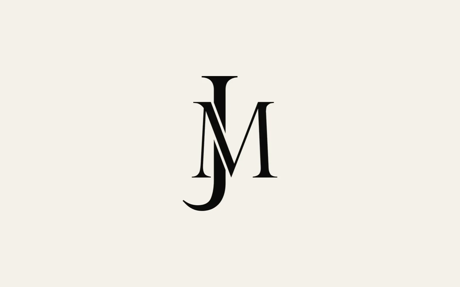
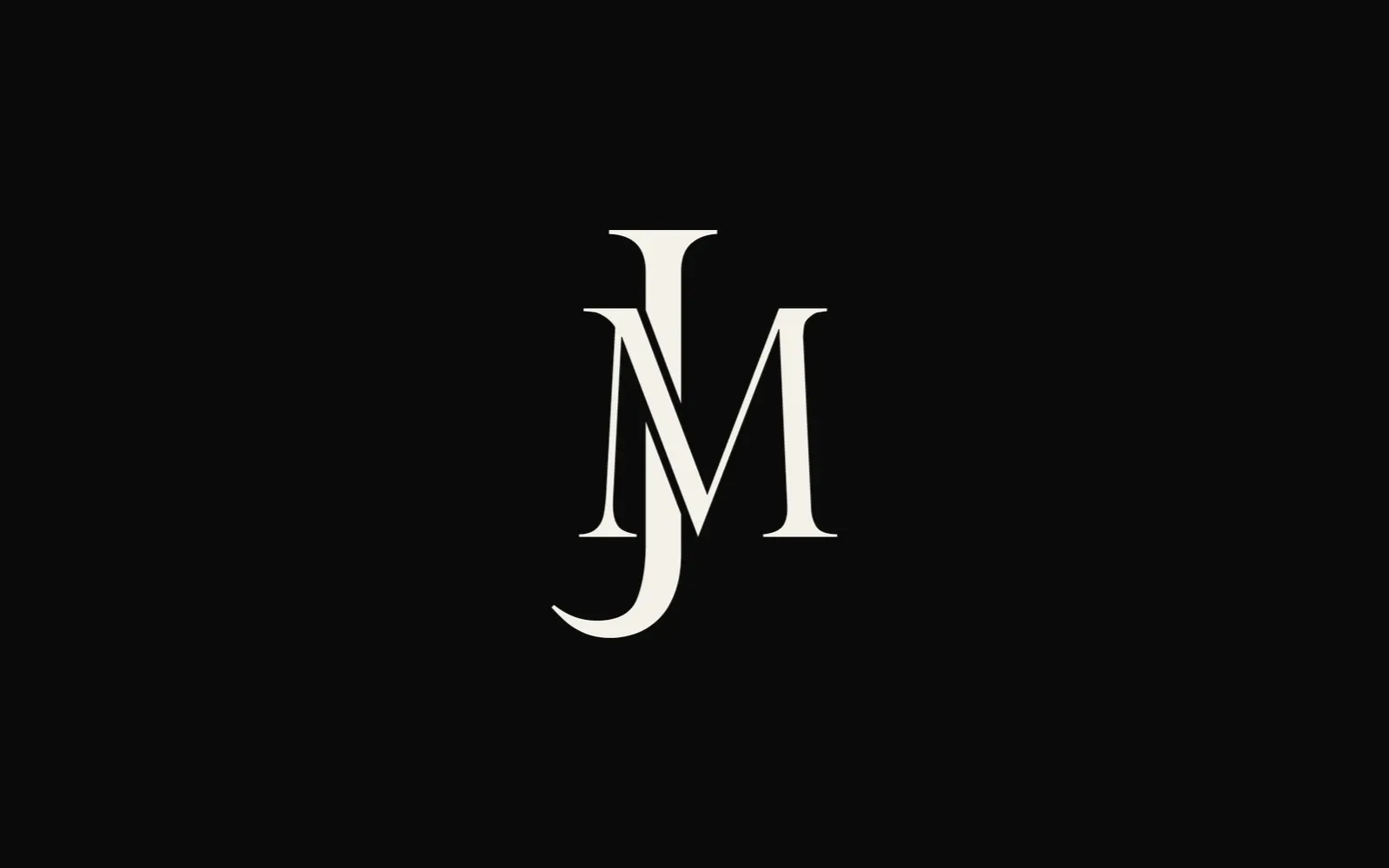
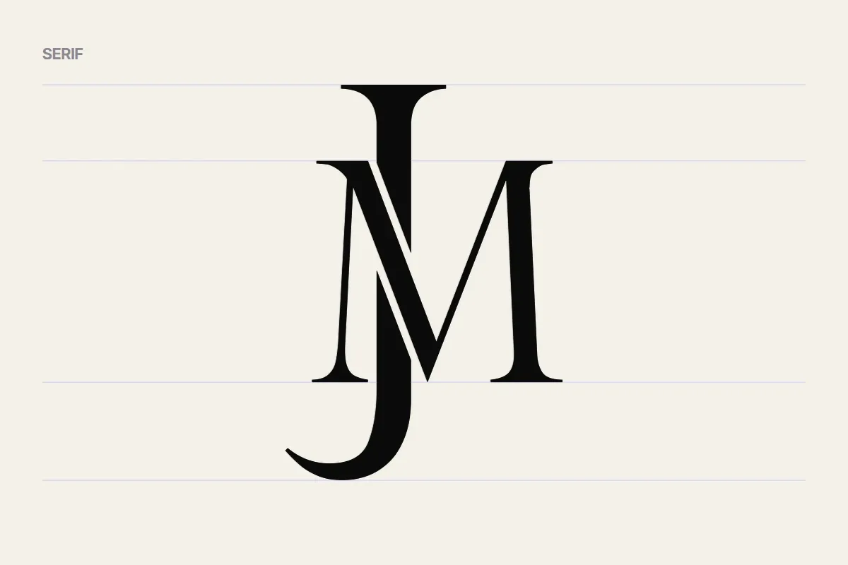
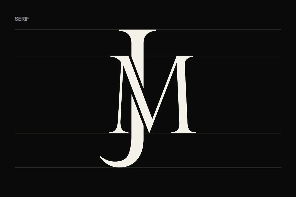
A JM monogram: a tall serif J that leads, threaded through the M and cut where they cross.
01 The mark
Two letters, one mark: the J leads, and the M works with it.
- J
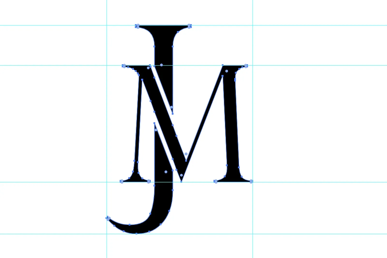
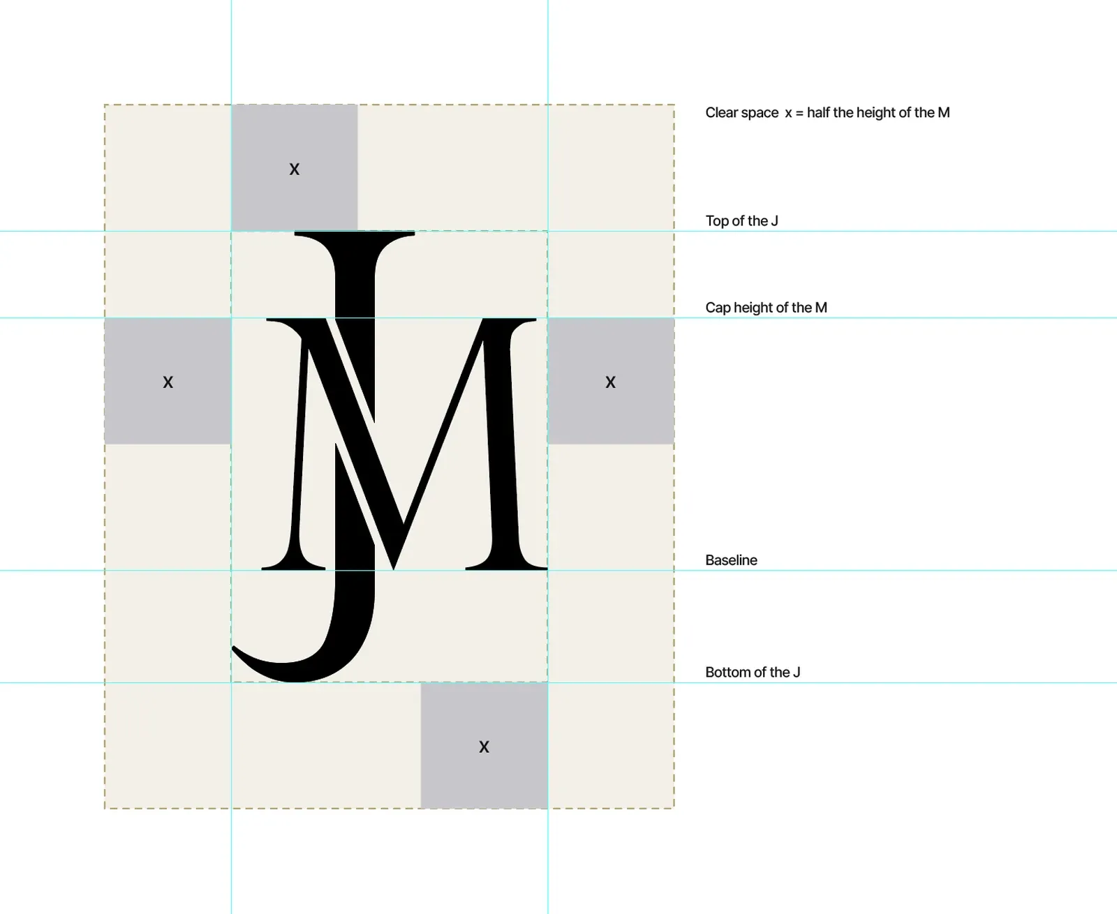
- The lead. Taller than the M: it rises above the M's cap height and drops below its baseline.
- M
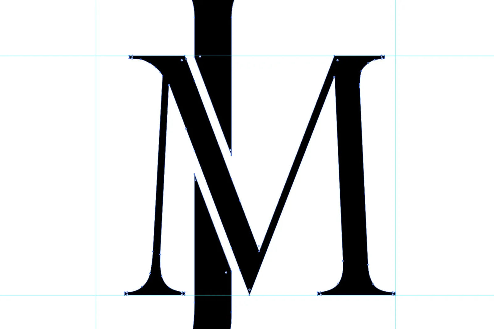
- The frame. Its thick diagonal crosses the J, and the J is cut where they meet, so the two letters read as one.
- JM
- Jayson Mercado. My initials, as a mark calm enough to sign my work.
- Project
- Personal mark
- Role
- Designer: monogram and personal brand
- Deliverables
- Monogram, Construction and clear space, Usage rules, Logo reel
- Tools
- Illustrator, After Effects
02 The brief
My personal brand needed a mark of its own: two letters that read as one, clean enough to work as a favicon and an avatar, and calm enough to sign my work.
03 Construction
04 Typography
05 Colour
- Black
#0B0B0BThe mark on light grounds, and the dark ground. - Cream
#F5F1E8The light ground, and the mark on dark. - Gold
#BAA56BThe mark on black, for special uses.
06 Usage
-
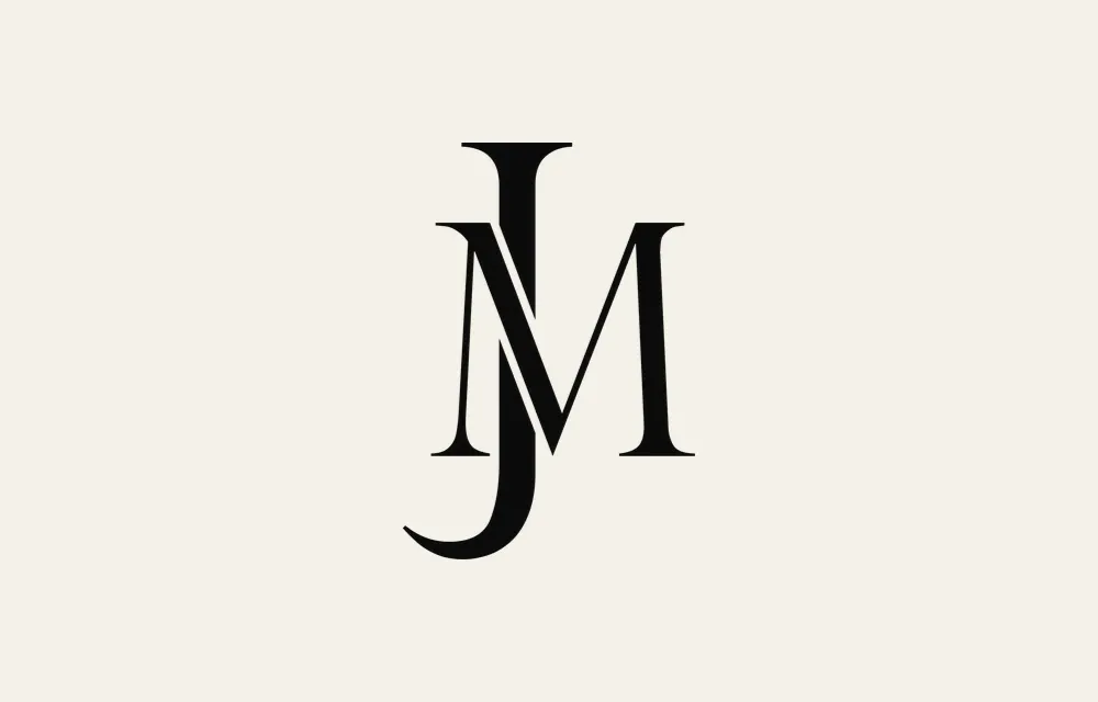
Black on cream -
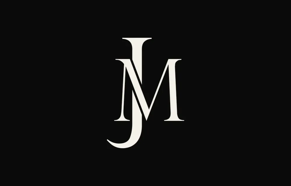
Cream on black -
Gold on black
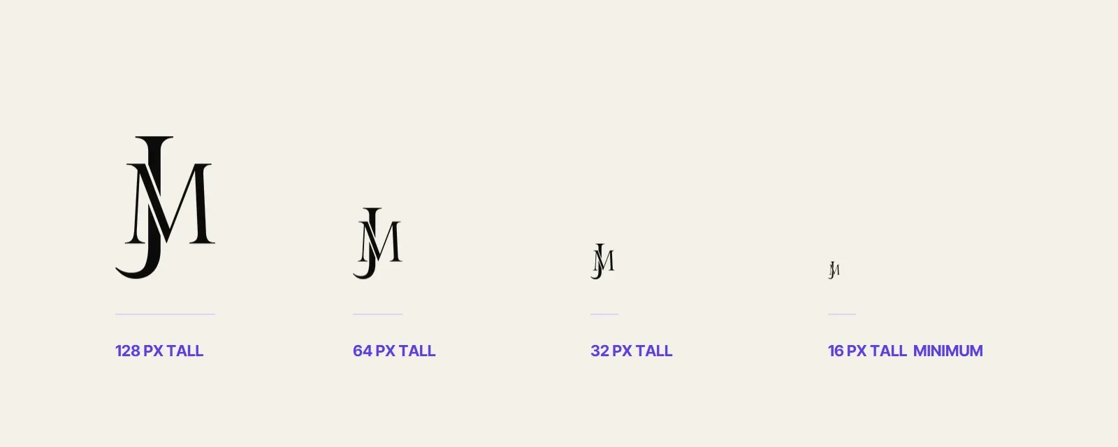
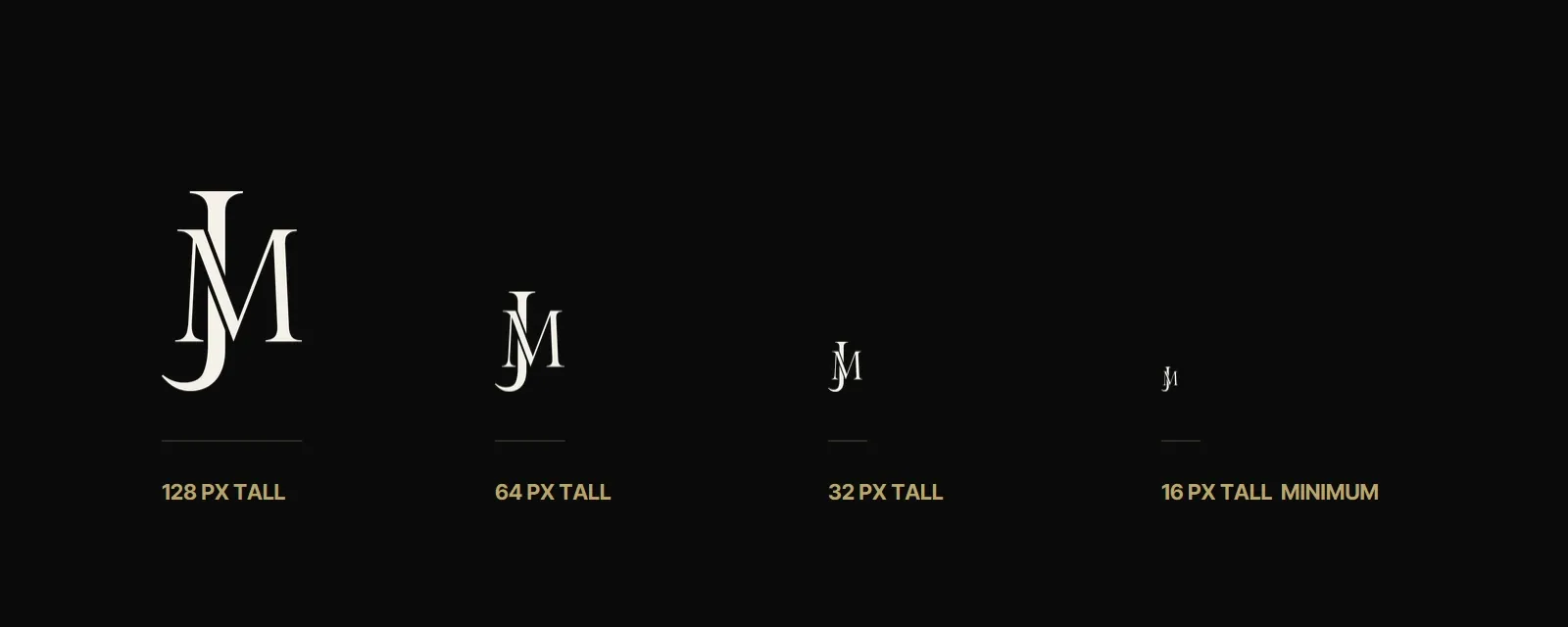
- Keep clear space equal to half the height of the M on every side.
- One colour at a time: black, cream or gold.
- Never outline, stretch, recolour or add effects.
- Use the official file; never retype the letters.
07 In use
-
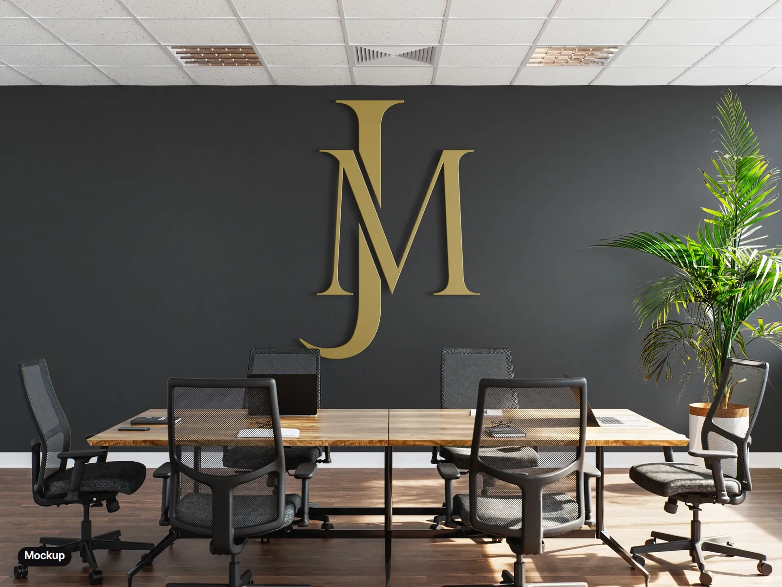
Mockup: gold dimensional letters on the wall. -
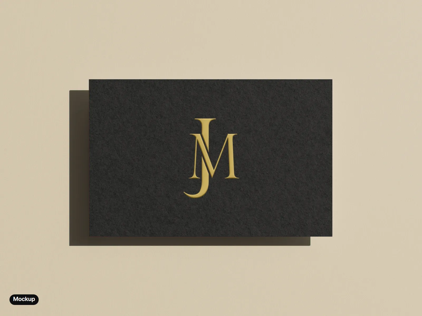
Mockup: a black business card, the monogram printed in gold and embossed. -
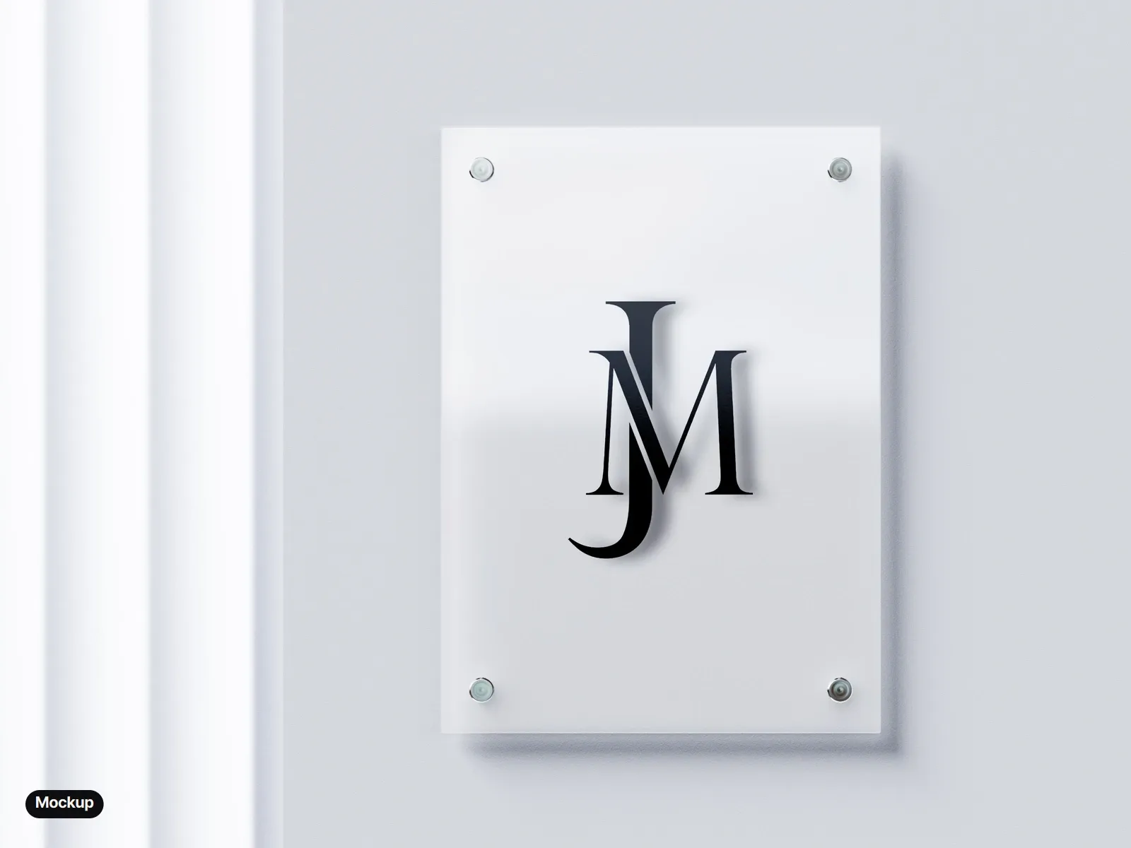
Mockup: a frosted glass sign plate. -
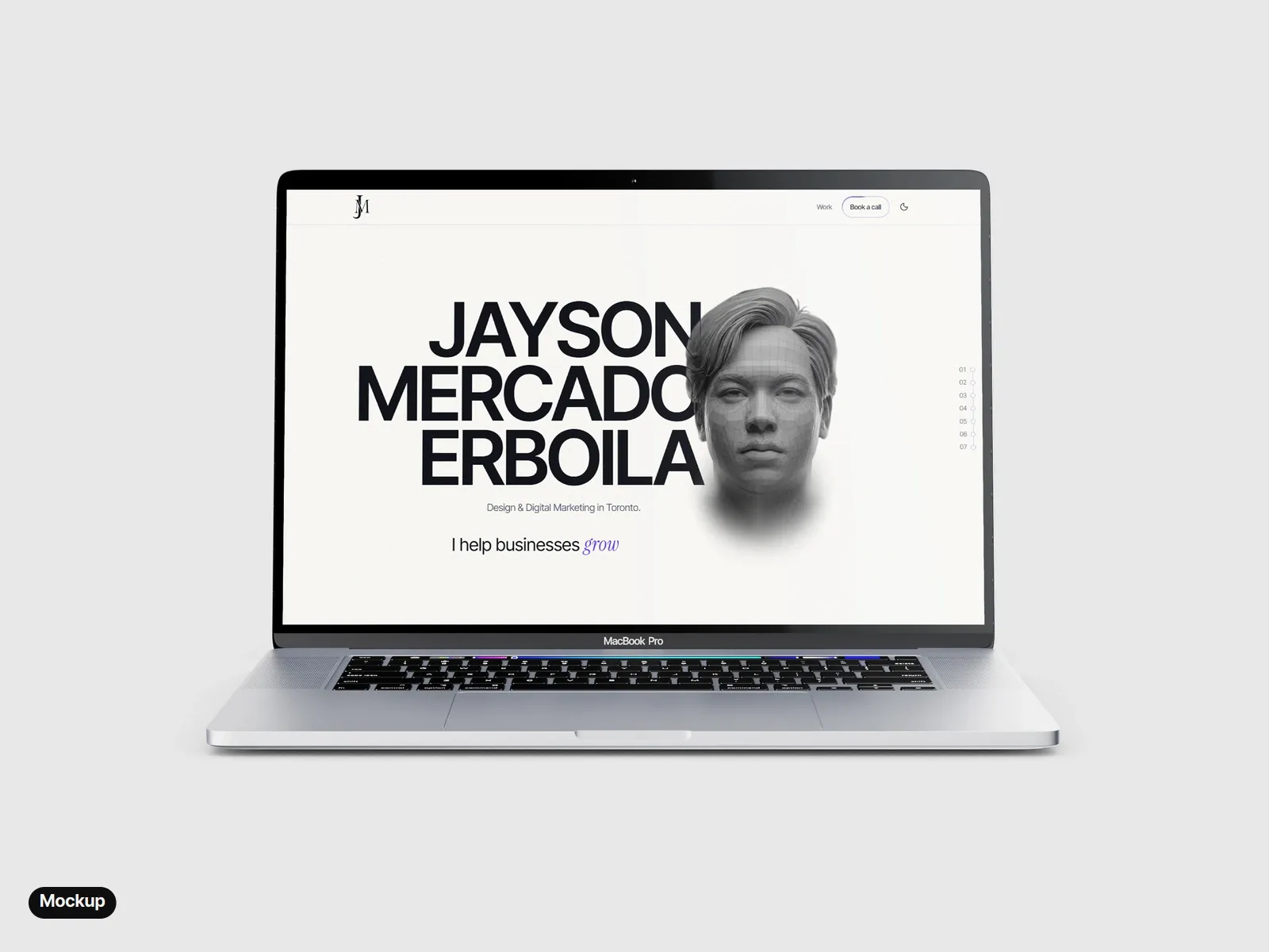
Mockup: this portfolio, with the monogram in the site header. -
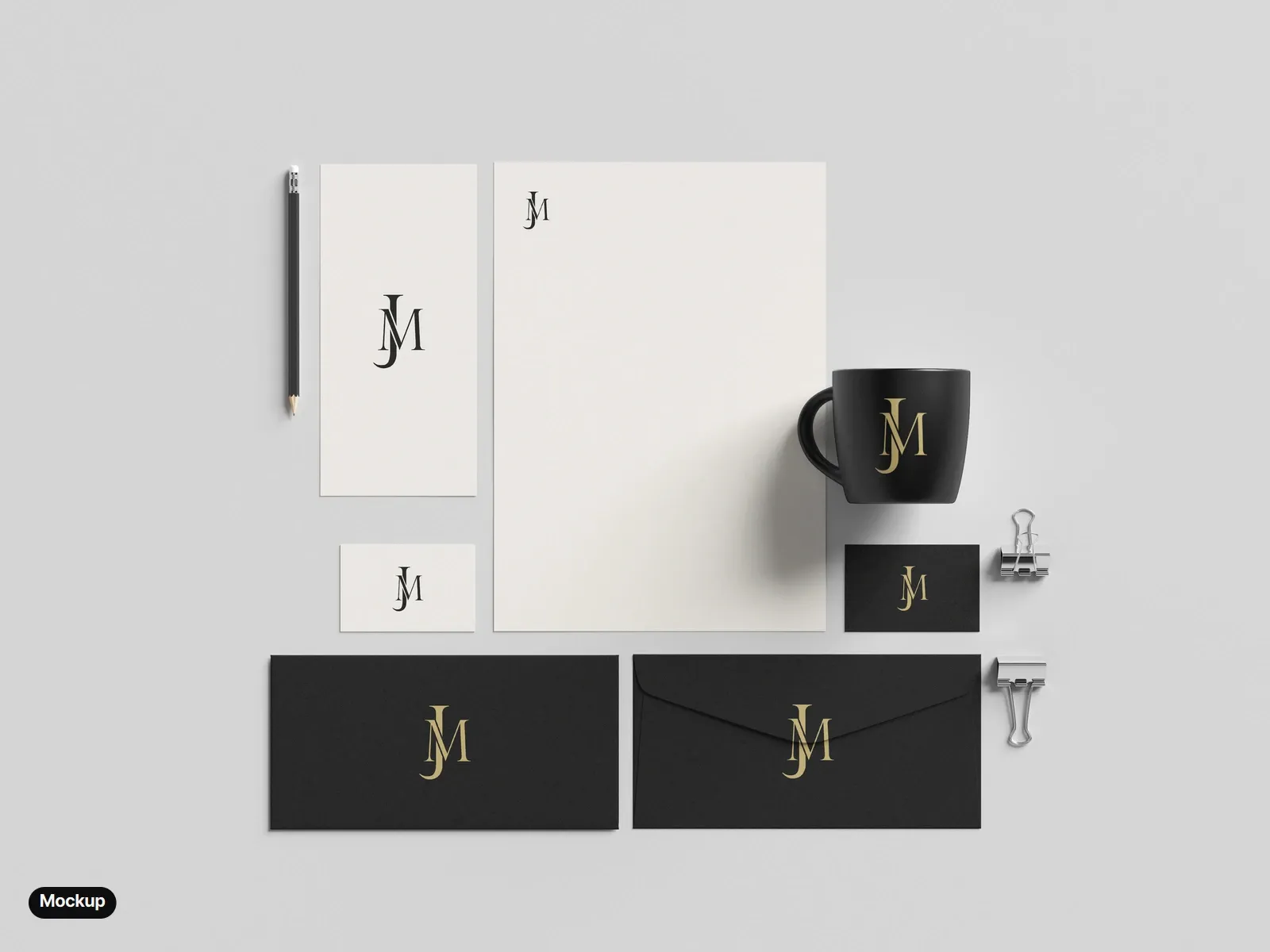
Mockup: letterhead, cards, envelopes and a mug.
Photo mockups made from free Mockups-Design.com templates, with the final monogram placed in Photoshop. The laptop shows this portfolio.
08 The reel
The reel shows the build: the J and the M drawn, offset and cut where they cross in Illustrator, then the finished mark flashing over black-and-white architecture before it settles, small and still, on black.