Devsign8

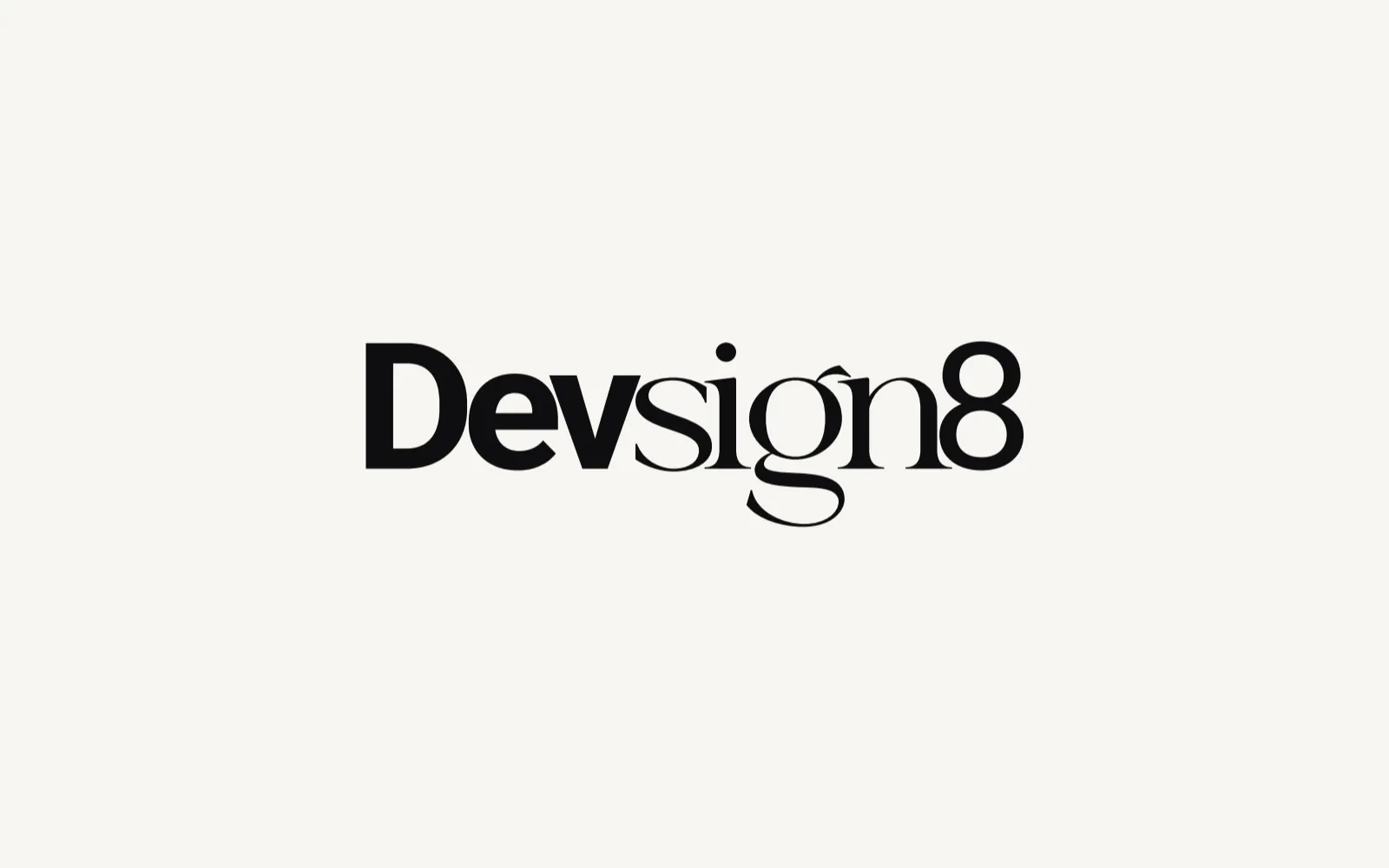
A wordmark that joins code and design: Dev in a heavy sans, sign8 in an elegant serif.

01 The mark

Dev for code, sign for design, and an 8 that turns on its side into infinity.

Dev
Development, the code. The websites and systems the studio builds, set heavy and upright.
sign
Design, the craft. Brand and visual design, set in an elegant serif.
8
Infinity, on its side. Infinity was always on my mind for this mark: I will never stop learning and discovering, on a loop.
Project
Own studio
Role
Founder: name, wordmark and brand rules
Deliverables
Wordmark, Construction and clear space, Usage rules, Logo reel
Tools
Illustrator, After Effects
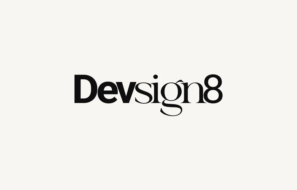
The final Devsign8 wordmark in black on warm paper: Dev in a heavy sans serif, sign8 in a high-contrast serif. The final Devsign8 wordmark in warm white on ink: Dev in a heavy sans serif, sign8 in a high-contrast serif.
The final Devsign8 wordmark in black on warm paper: Dev in a heavy sans serif, sign8 in a high-contrast serif.

02 The brief

My studio builds websites and designs brands, and its name had to say both in one word. The mark had to read as one word, not two disciplines, work in black on light and white on dark with no colour needed, and stay sharp from a 120 px header to print.

03 Construction
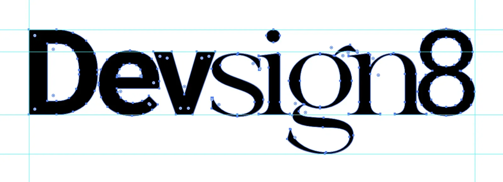
Screenshot from Adobe Illustrator: the final wordmark selected with the Direct Selection tool, every anchor point showing, on cyan guides at the cap height, x-height, baseline and descender, with vertical guides at its left and right edges.
The final wordmark in Illustrator, every anchor point selected. Four guides carry all eight letters, the sans and the serif alike: the cap height, the x-height, the baseline and the descender.
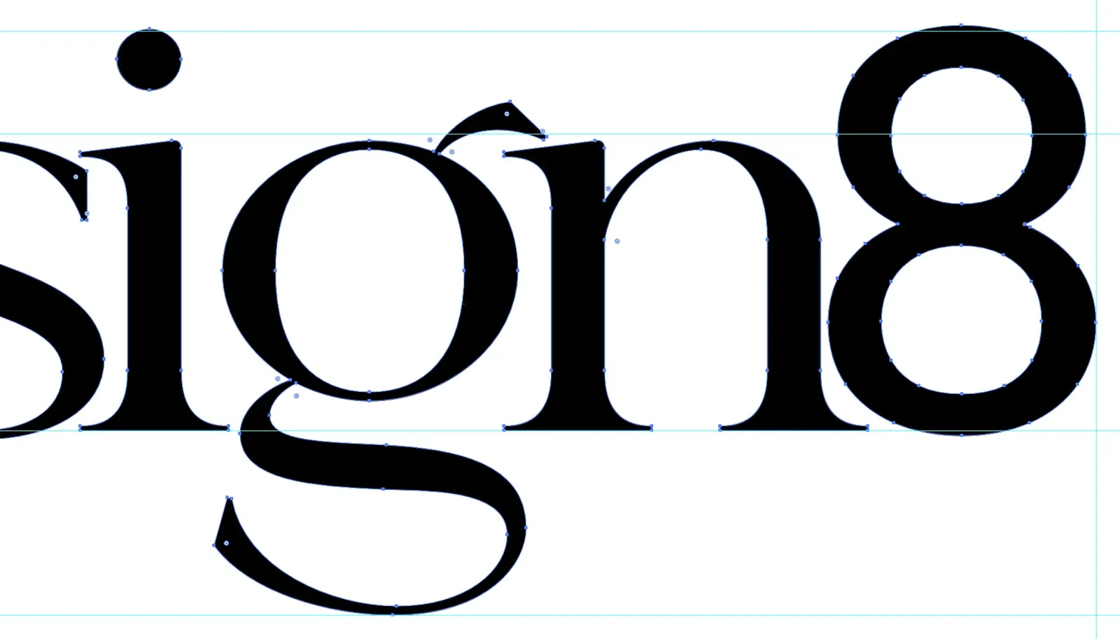
Screenshot from Adobe Illustrator at 400%: the g, n and 8 with their anchor points, the g's accent and long, curling tail falling below the baseline to the descender guide.
At 400%: the g's loop and long tail, the decorative accent that made this serif the choice, drawn with 28 anchor points.

04 Typography

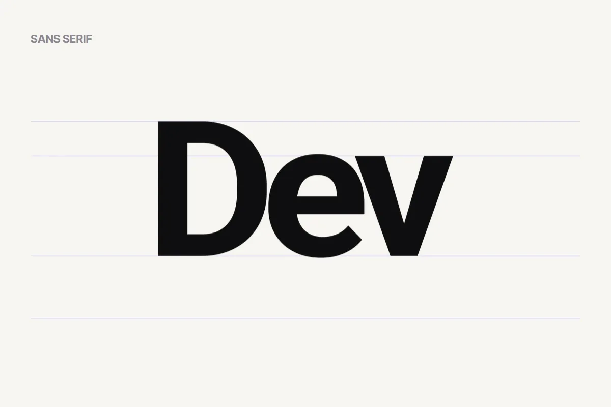
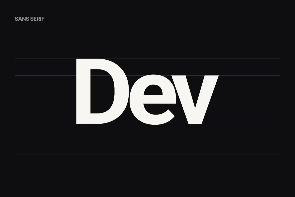
  • Dev, cut from the wordmark, on faint guides: heavy, upright letters with no serifs. Dev, cut from the wordmark, in warm white on ink on faint guides: heavy, upright letters with no serifs.
    Sans serif Dev A heavy sans serif: solid, upright and technical. It carries the code side of the studio and gives the word its weight.
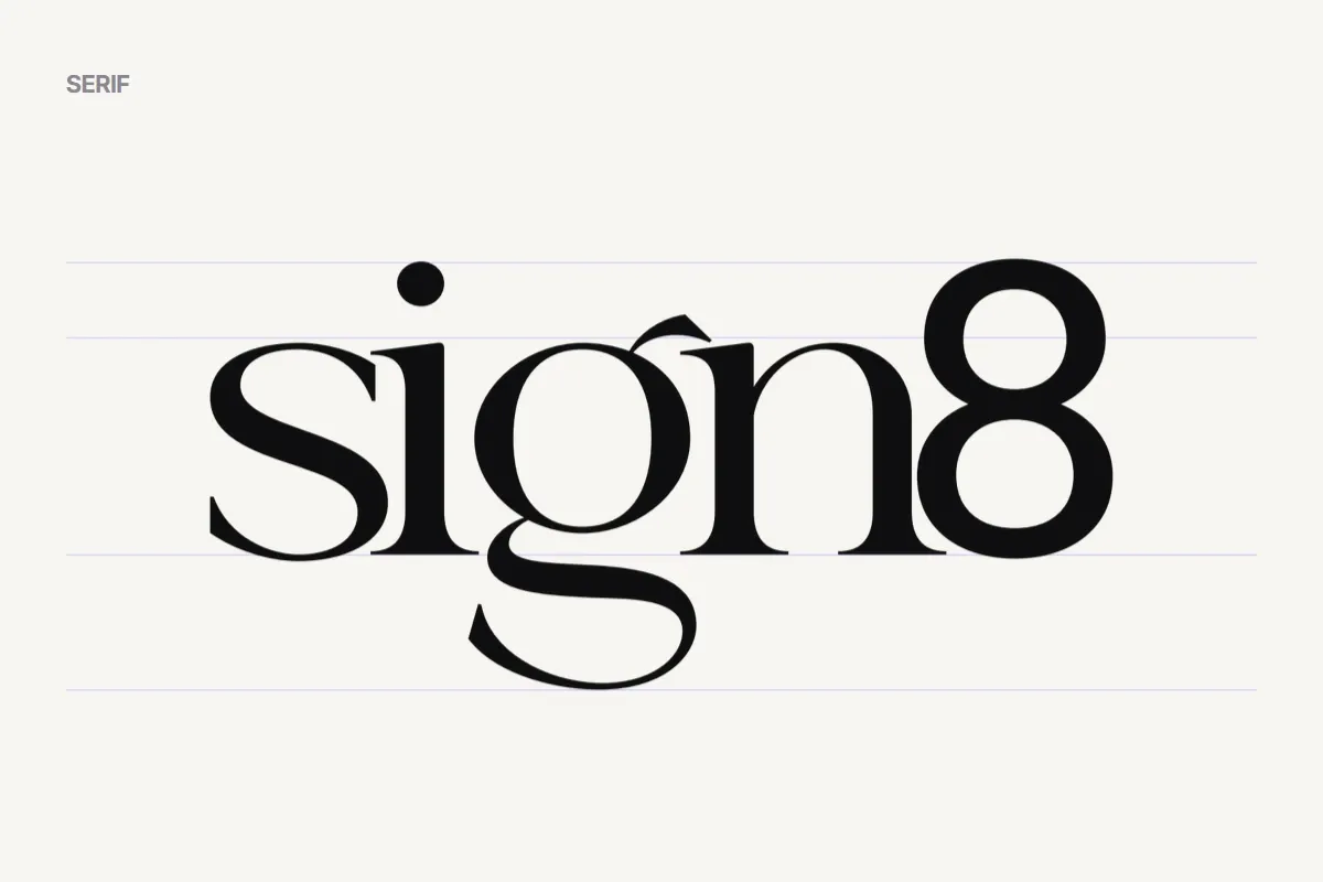
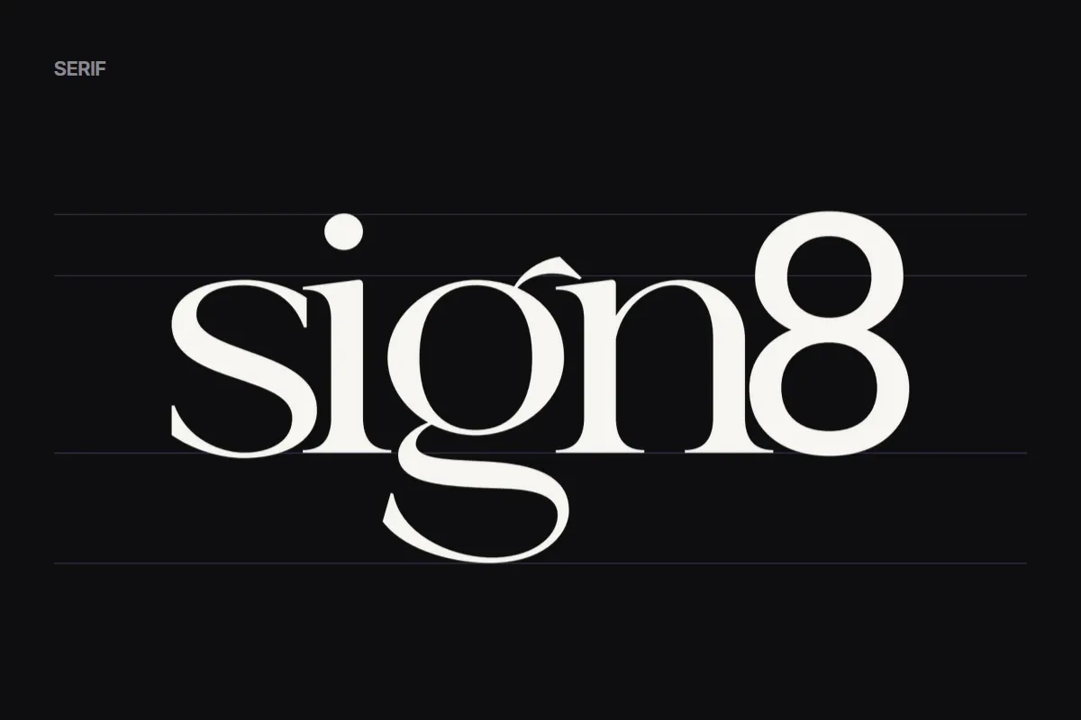
  • sign8, cut from the wordmark, on the same guides: high-contrast letters with fine serifs, an accent over the g and a long, curling tail. sign8, cut from the wordmark, in warm white on ink on the same guides: high-contrast letters with fine serifs, an accent over the g and a long, curling tail.
    Serif sign8 A high-contrast serif: simple, clean and elegant, with extravagant curves and decorative tails as the accent. It carries the design side.

Two type families, one word: Dev and sign8 sit on the same cap height and baseline, and the letters are set tight, so the sans and the serif lock together instead of reading as two names.

05 Colour

  • Ink #0E0E0F The wordmark on light grounds, and the dark ground.
  • Paper #F7F5F1 The light ground, and the wordmark on dark.
  • Violet #5A3FE0 The studio's accent colour; the wordmark goes white on it.

06 Usage
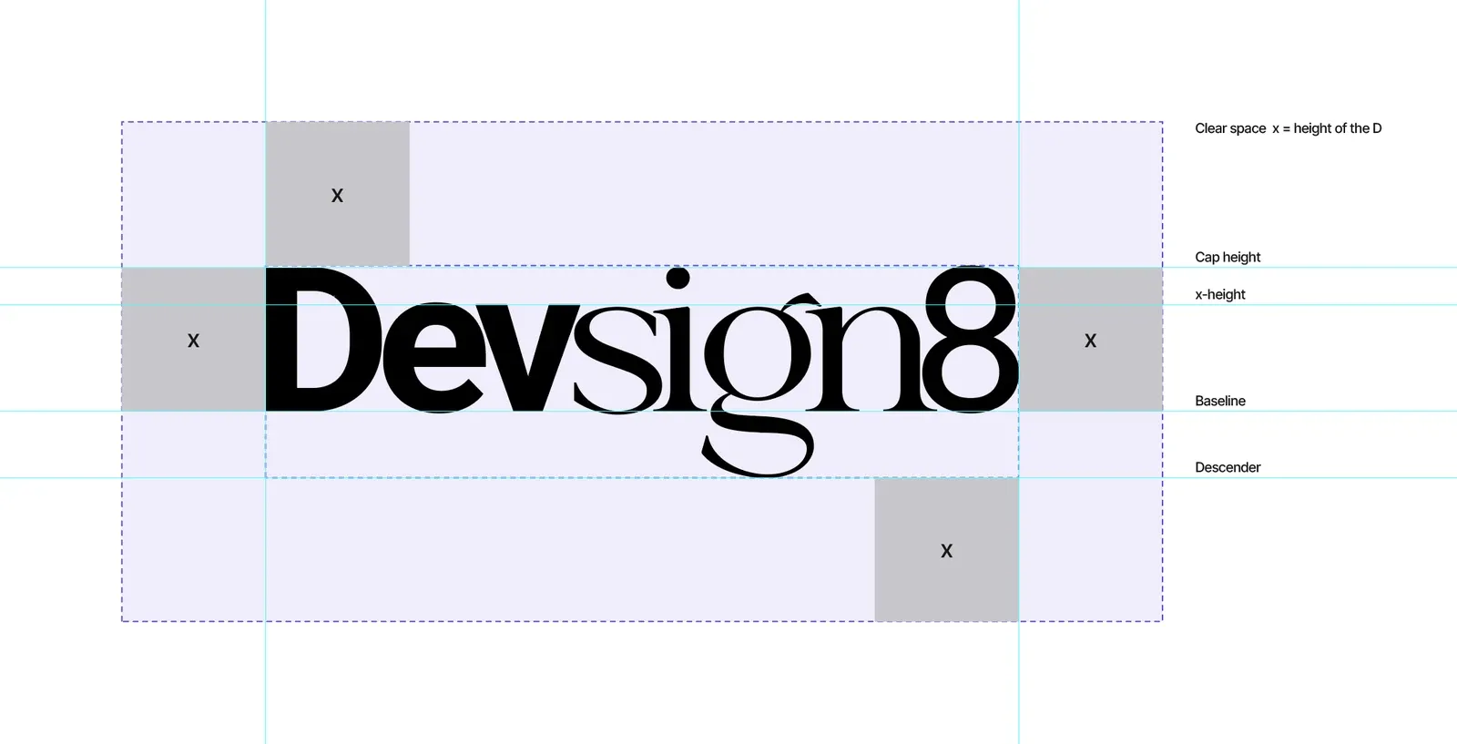
Screenshot from Adobe Illustrator: the wordmark inside a pale violet clear-space zone with dashed edges and cyan guides, a grey square marked x on each side as the unit, and black labels: clear space x = height of the D, cap height, x-height, baseline and descender.
Clear space is x, the height of the D, on every side, at whatever size the wordmark is used. The grey squares mark it; nothing enters the violet zone.
  • The wordmark in ink on paper.
    Ink on paper
  • The wordmark in paper on ink.
    Paper on ink
  • The wordmark in white on violet.
    White on violet
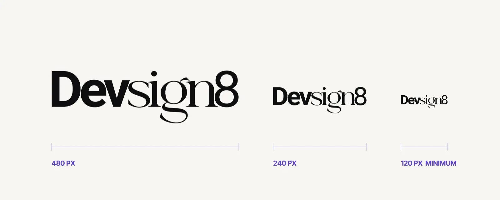
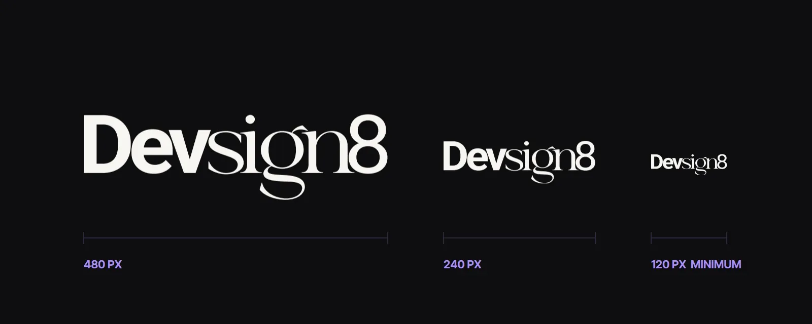
The wordmark at 480, 240 and 120 pixels wide, each with a measure line and label; 120 px is marked as the minimum. The wordmark in warm white on ink at 480, 240 and 120 pixels wide, each with a measure line and label; 120 px is marked as the minimum.
Never smaller than 120 px wide on screen, or 32 mm in print.
  • Keep clear space equal to the height of the D on every side.
  • One colour at a time: ink on light, paper or white on dark and on violet.
  • Never recolour, stretch, outline or add effects.
  • Use the official file; never retype the wordmark.

07 In use

  • Mockup: the wordmark as white dimensional letters on a charcoal meeting-room wall, above a wooden table and black office chairs.
    Mockup: dimensional letters on the meeting-room wall.
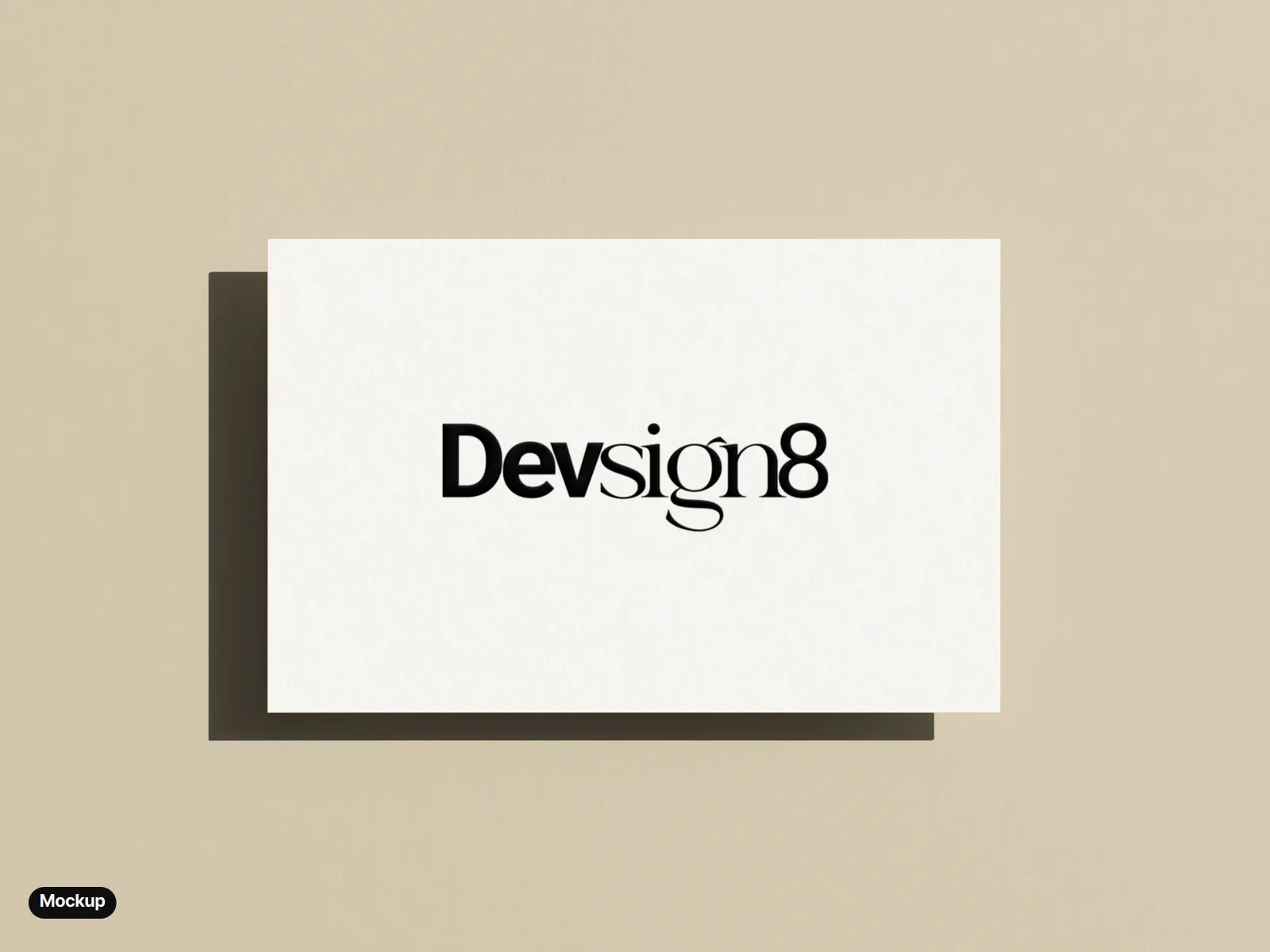
  • Mockup: a cream business card on a warm beige ground, the wordmark printed in black and embossed.
    Mockup: a business card, the wordmark printed in black and embossed.
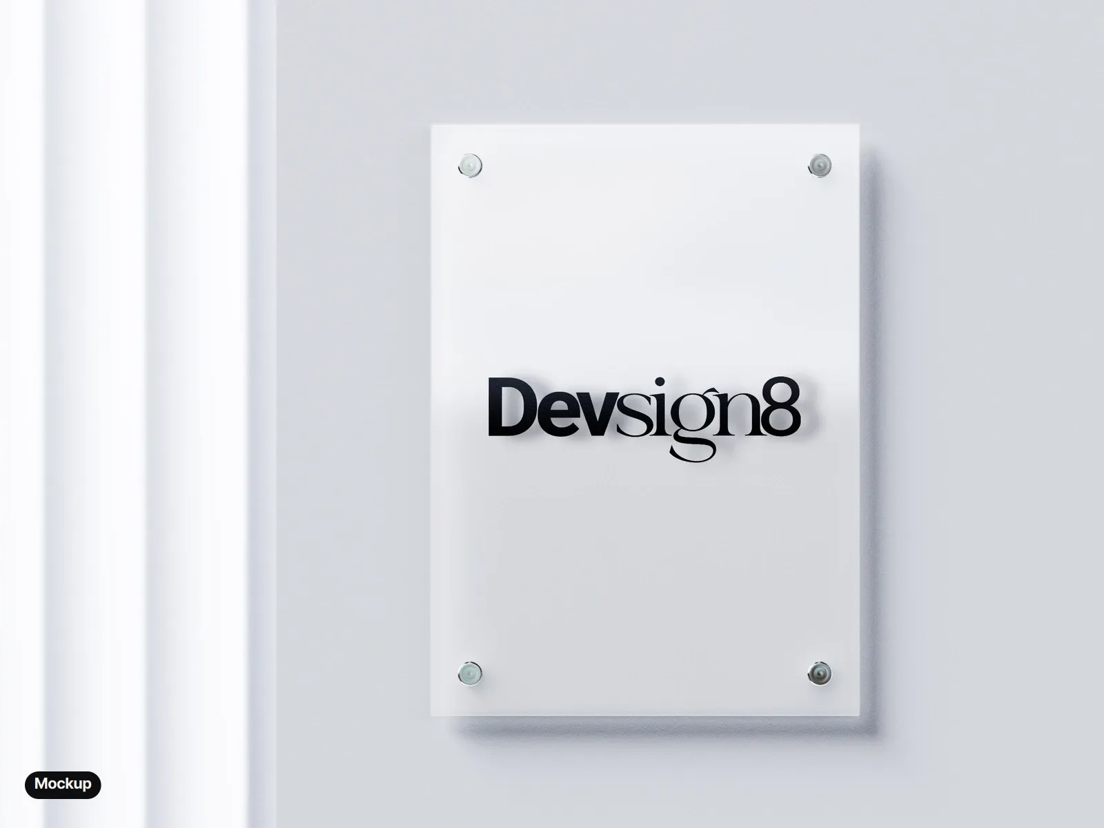
  • Mockup: a frosted glass sign plate on four steel standoffs with the black wordmark, on a pale wall.
    Mockup: a frosted glass sign plate.
  • Mockup: a laptop showing the devsign8.com home page, dark, with the wordmark in the header and the headline Branding, websites, and SEO that help your business get found online.
    Mockup: devsign8.com, with the wordmark in the site header.
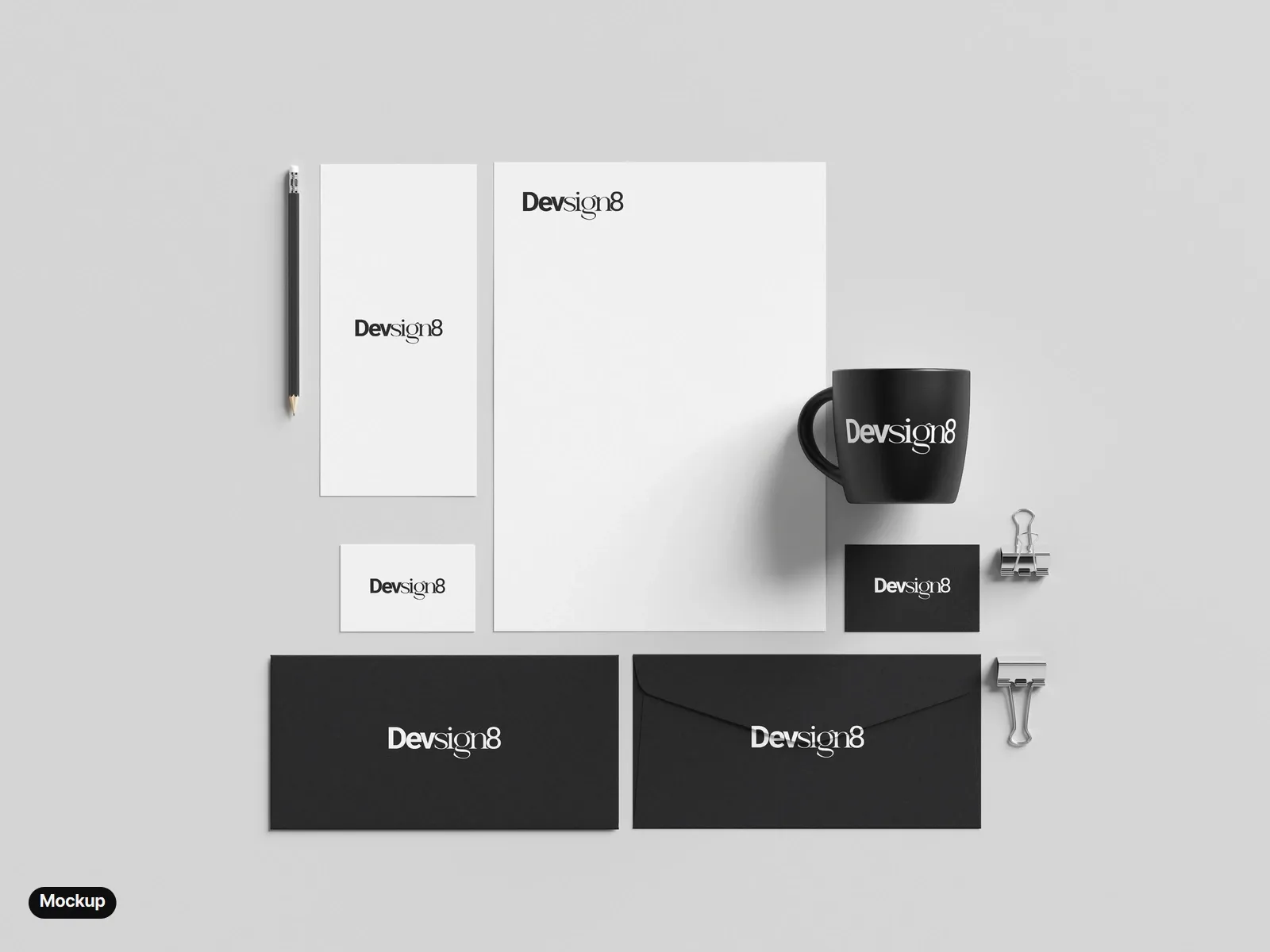
  • Mockup: a stationery set from above: a letterhead, a DL card and a white business card with the black wordmark; a black business card, two black envelopes and a black mug with the white wordmark.
    Mockup: letterhead, cards, envelopes and a mug.

Photo mockups made from free Mockups-Design.com templates, with the final wordmark placed in Photoshop. The laptop shows the live devsign8.com.

08 The reel

Animated ink over the wordmark I set and kerned in Illustrator.

The reel shows the mark coming to life: Dev painted and sign written in animated ink, then the lettering set, kerned and outlined in Illustrator before the final wordmark lands.

Back to top