UNF: Innovation flows here
A seamless carousel and a campus screen poster in UNF's new brand, each as a still and in motion.
01 The brief
UNF had just launched a new brand, Innovation flows here. I made two pieces in it, each as a still and in motion, to show I can work inside their system from day one.
- Project
- Concept / spec work
- Role
- Research, design and animation
- Deliverables
- Seamless carousel, Carousel in motion, Campus screen poster, Animated poster, Captions and timing
- Tools
- Illustrator, Photoshop, After Effects
Concept / spec work, not official UNF content.
UNF: Innovation flows here
02 Reading the brand
Before designing anything I took the new brand apart: the logo SVG, the website's CSS and the launch assets. The idea is flow. In 1895 Tesla's patents powered the station at the Falls, and the tagline says it plainly: Innovation flows here. It always has.
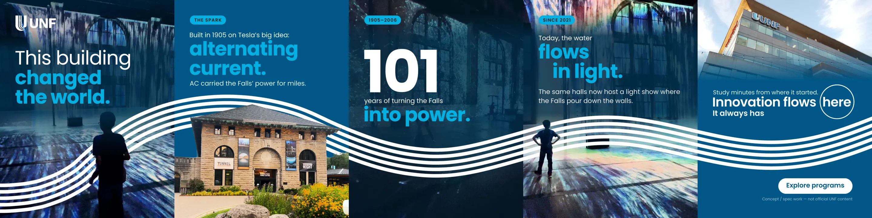
The signature device is the Flow Lines: parallel ribbons of equal weight that sweep through the frame and weave behind people, so the subject sits inside the flow.
Then I audited the live Instagram grid. The designed posts use only UNF Blue, Falls Cyan, white and black, and none of the latest twelve posts showed Niagara itself. The brand's story is the Falls, so that became my brief.
Colour came next. Cyan on UNF Blue barely passes contrast, so cyan only ever marks one large, bold payoff word per slide.
| Pairing | Contrast | How I used it |
|---|---|---|
| White on UNF Blue | 7.83:1 | Any text |
| Falls Cyan on UNF Blue | 3.12:1 | Large bold words only |
| Falls Cyan on white | 2.51:1 | Never for text |
| Falls Cyan on deep navy | 5.61:1 | Why the photo scrims are navy |
| White on Graduate Magenta | 5.10:1 | The graduate accent |
03 A type system from research
I researched carousel typography from the classics (Bringhurst, Butterick) to current practice, then turned it into rules: few sizes, a big jump from headline to body, and nothing under 28 px, which renders near 10 pt on a phone.
Poppins' default leading is loose, so headlines are set tight by hand, with UNF's two-weight move: the setup in Regular, the payoff in Bold.
Instagram's 3:4 profile grid trims about 34 px from each side of a cover, so every slide keeps a 96 px margin. On a seamless carousel that also leaves a text-free band around each seam: lines and photos cross the cut, words, faces and logos never do.
| Tier | Size | Weight |
|---|---|---|
| Stat numeral | 260 to 360 px | Bold |
| Hero headline | 110 to 150 px | Regular and Bold |
| Content headline | 72 to 96 px | Regular and Bold |
| Body | 34 to 40 px | Regular |
| Label | 24 to 28 px, caps | SemiBold |
04 Follow the Flow: the carousel
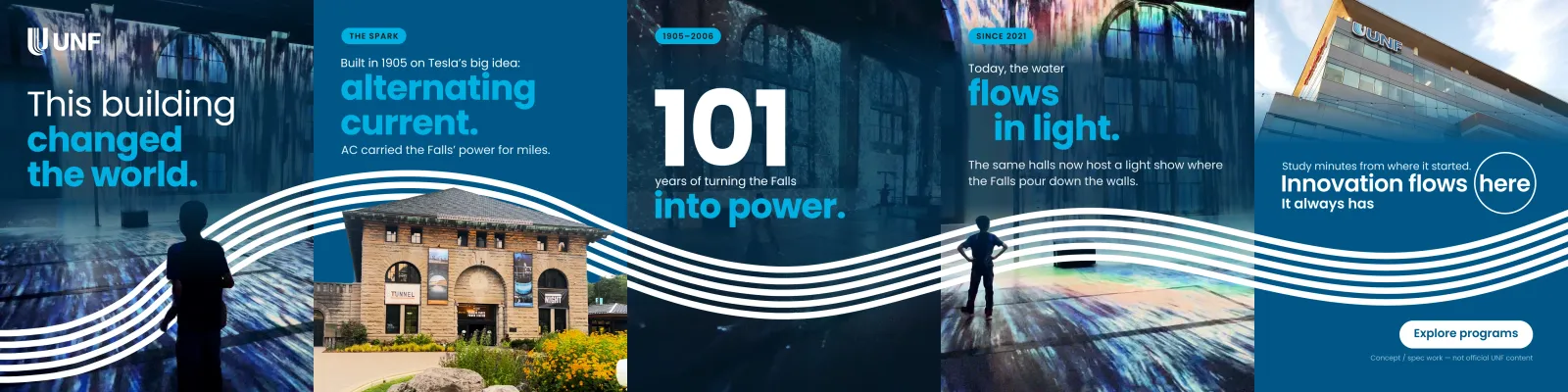
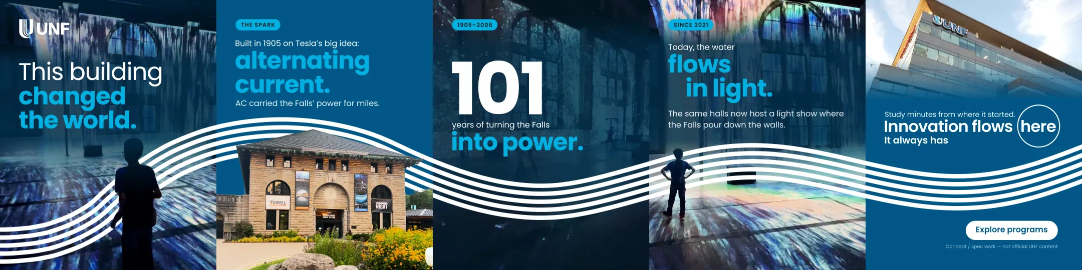
The story runs through one building: the Niagara power station, built in 1905 on alternating current, which turned the Falls into power for 101 years and now hosts a light show. Slide five lands on the UNF campus: Innovation flows here.
Every photo is a frame from my own iPhone and DJI Osmo Pocket footage. In Photoshop I cut out the child and the building, so the Flow Lines pass behind them, and cleaned the station's roof edge with a script.
The lines are drawn from one editable spine path, which a script turns into five smooth parallel lines across the 5400 px artboard. Navy scrims are baked into the photos so the cyan stays readable.
05 The carousel in motion
For the animated version I exported the Illustrator layout as data and rebuilt it natively in After Effects: live type, shape-layer lines and a slow push-in on each photo.
Every element rises in from top to bottom, then the Flow Lines draw on last. Each slide's lines start at the exact point where the previous slide's ended, so the line keeps flowing as you swipe.
This cut swipes itself on the music: each swipe lasts one beat and lands on a bar's downbeat, and the incoming slide waits to animate until it lands.
06 Step inside your master's: the poster
The second piece is a 9:16 poster for campus screens. I tried three directions first, all with the same type block: the neon U in the lobby, the campus tower and the light show hall.
Then I made it specific: the MA in Digital Media and Global Communications, built around UNF's VR Lab. Magenta is UNF's colour for the graduate journey, so the Flow Lines turn magenta.
I upscaled the VR Lab photo in Photoshop and cut her out, so the lines run behind her. The layout has five levels: headline, program, the facts, a button and fine print, on 90 px margins.

07 The poster in motion
The animated poster speaks the carousel's motion language: the type rises top to bottom, then the magenta lines draw on, while the photo breathes in and out by 2%.
It is a 15-second seamless loop. In the last 0.8 seconds the type and lines fade out, so the first frame follows the last without a jump.
There are two cuts: a silent one for campus screens and this one, with music, for social. A script found the musical lift so the 15 seconds start on it.
08 Captions and timing
These are planned captions; the pieces never ran. They follow UNF's caption pattern: a short hook, a line or two of story, a call to action, then a few hashtags, in Canadian spelling.
The carousel leads in the feed and its motion cut follows as a Reel to reach people who don't follow UNF yet. The poster loops on campus screens, and its music cut runs as a Reel ahead of each intake.
| Piece | Caption |
|---|---|
| Carousel | This building changed the world. Swipe to see how the Falls became power, then light, then a campus. Explore programs: link in bio. #UNF #NiagaraFalls #InnovationFlowsHere |
| Animated poster | Step inside your master's. The MA in Digital Media and Global Communications, 18 months, four intakes a year. Explore the program: link in bio. #UNF #GradSchool #InnovationFlowsHere |