Devsign8 Instagram Safe-Zone Toolkit
A ten-Reel series and a Photoshop template that keep designs clear of Instagram's buttons.
01 The toolkit
Instagram covers part of every post. This toolkit shows exactly which part, for every format, and builds the canvas to avoid it.
- Project
- Own studio, content series
- Role
- Research, design, content and posting
- Deliverables
- Safe-zone spec for 12 formats, Photoshop template script, Ten Instagram Reels
- Tools
- Photoshop, Premiere Pro, After Effects
- Canvas
- 1080 × 1920
- Safe area
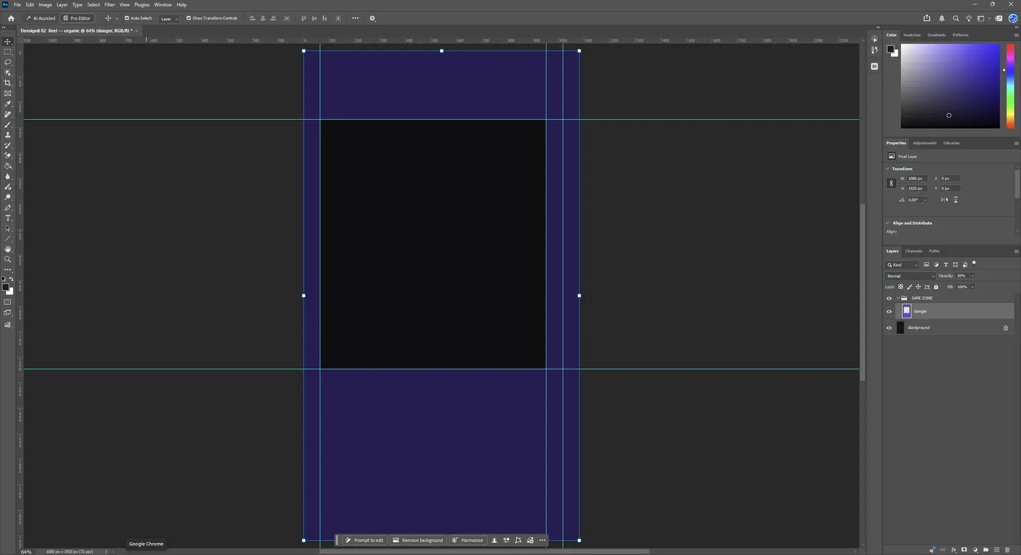
- 885 × 978
- Keep clear (top, right, bottom, left)
- 270, 130, 672, 65
The bottom 672 px (35%) holds the caption and audio. The like, comment, share and save rail needs 130 px on the right, not 65.
02 The problem
I was planning my own Instagram content and studying what other accounts post. Again and again the text, images or video were covered by ads, buttons and the caption.
So I researched why. The answer is safe zones: parts of every format that Instagram draws over, different for a Reel, a Story, a feed post, a cover and a highlight.
03 The research
For every type of post I worked out the size, the aspect ratio and exactly which margins Instagram takes.
The 9:16 margins come from Meta's percentages, not typed by hand: 14% at the top, 35% at the bottom for Reels and ads, 20% for an organic Story, 6% at the sides.
The one most guides miss is the action rail: the like, comment, share and save column down the right edge of a Reel. Reserving 130 px there instead of 65 is the difference between a logo that survives and one that sits under the share button.
Meta changes these specs without notice, so check Ads Manager before a high-stakes campaign.
| Format | Canvas | Keep clear (top, right, bottom, left) | Safe area |
|---|---|---|---|
| Story, organic | 1080 × 1920 | 270, 65, 384, 65 | 950 × 1266 |
| Reel, organic | 1080 × 1920 | 270, 130, 672, 65 | 885 × 978 |
| Story or Reel ad | 1080 × 1920 | 270, 130, 672, 65 | 885 × 978 |
| Reel cover | 1080 × 1920 | 270, 130, 672, 65 | 885 × 978 |
| Feed 3:4 | 1080 × 1440 | 120 each side | 840 × 1200 |
| Feed 4:5 | 1080 × 1350 | 120 each side | 840 × 1110 |
| Feed 1:1 | 1080 × 1080 | 120, 165, 120, 165 | 750 × 840 |
| Feed landscape | 1080 × 566 | 60, 350, 60, 350 | 380 × 446 |
| Carousel slide 3:4 | 1080 × 1440 | 120 each side | 840 × 1200 |
| Carousel ad card 1:1 | 1080 × 1080 | 120 each side | 840 × 840 |
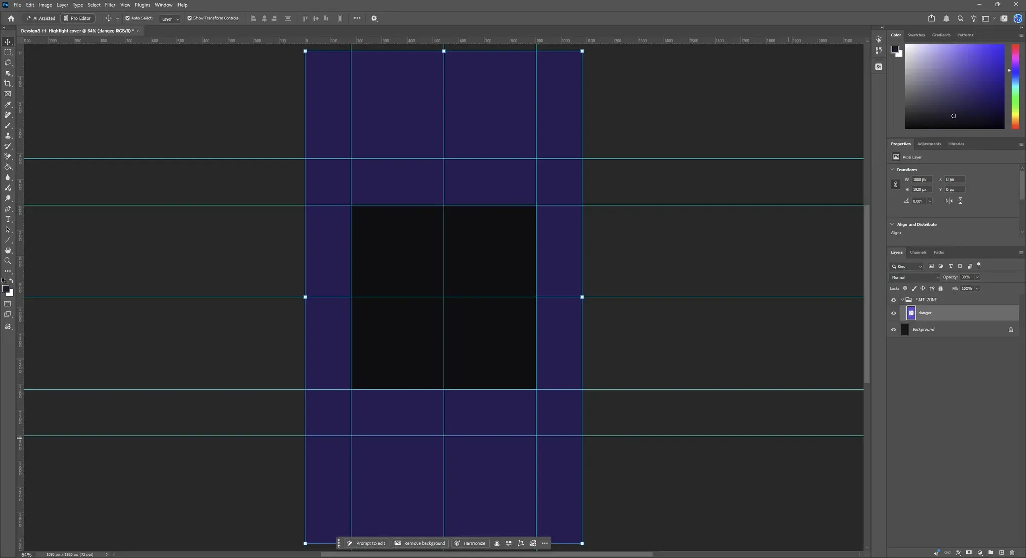
| Highlight cover | 1080 × 1920 | 600, 180, 600, 180 | 720 × 720 |
| Profile photo | 1080 × 1080 | 158 each side | 764 × 764 |
04 The tool
I built the gridlines in Photoshop first, so my carousels and posts stayed inside the safe zones, then marked the same zones in Premiere Pro and After Effects for video.
Then I turned it into a Photoshop script: pick a format, and it builds the canvas at the exact size, places every guide, and tints the danger zones violet so you can see them.
05 The series
Every Reel works the same way: it opens on a problem you can picture, then a spec card answers it with the exact numbers. Ten formats, ten Reels, alternating dark and light so they read as one series.
-
JM Design
Your logo is under Instagram's share button right now. Reels need 130px clear on the right, not the usual 65. #reelstips #graphicdesign
JM Design · Original audio
-
JM Design
A square post loses 135px from each side on your profile grid. Keep your logo inside the middle 810px. #instagramtips #graphicdesign
JM Design · Original audio
-
JM Design
A Reel cover can't be edited after you post. It has to work at 9:16 and as a 3:4 grid tile, cropped 240px top and bottom. #reelstips #instagramtips
JM Design · Original audio
-
JM Design
The bottom 672px of your Story belongs to Instagram. The reply bar, link sticker and music ticker sit on top of it. #instagramtips #graphicdesign
JM Design · Original audio
-
JM Design
Your 4:5 post loses 34px per side on the grid. Enough to clip a logo that sits close to the edge. #instagramtips #graphicdesign
JM Design · Original audio
-
JM Design
Your profile photo loses its corners, every time. Instagram shows your 1080 × 1080 upload as a small circle. #instagramtips #branding
JM Design · Original audio
-
JM Design
Instagram never covers a feed post. The username sits above the image and the buttons below, so the whole frame is yours. #instagramtips #graphicdesign
JM Design · Original audio
-
JM Design
Slide one sets the shape of every slide after it. Build every slide at 1080 × 1440 and nothing gets cropped. #carouseldesign #instagramtips
JM Design · Original audio
-
JM Design
Only the centre circle of your highlight cover shows. Centre your icon both ways inside the middle 720px. #instagramtips #branding
JM Design · Original audio
-
JM Design
One 9:16 master. Four placements. No re-cutting. Keep 270px clear at the top and 672px at the bottom. #reelstips #socialmediadesign
JM Design · Original audio
06 Captions and timing
Each caption repeats the hook, explains the problem in plain numbers, then makes one ask: comment TOOLKIT for the Photoshop script, or get it at devsign8.com. Three hashtag sets rotated, for designers, for Instagram tips and for branding.
Ten Reels in four weeks, on weekday evenings around 6:00 PM Toronto time: one or two a week, with a three-Reel push on day 8. The tenth, Build one 9:16 master, closed the series on day 27.
JM Design Wednesday, 6:00 PM · Reel cover
A Reel cover can't be edited after upload. Get it right once. It has to work twice: full-screen at 9:16, and again as a 3:4 tile on your profile, where the top and bottom 240px are cropped away. Comment TOOLKIT for the script that builds the cover canvas with the grid crop already marked. Also at www.devsign8.com
07 Results and what I learned
The first nine Reels, from an account with almost no followers yet, so these are small numbers. What matters is what they say.
Hooks that named a loss people could picture did best: the 4:5 grid crop, the Story bottom and the Reel cover you can't edit. The best reached 14 times more people than the weakest. Nobody commented TOOLKIT: I'm still early, without the followers a comment ask needs.
-
The whole series (9 Reels)
326 people reached
- Views
- 374
- Likes
- 2
- Comments
- 0
-
Best: your 4:5 post loses 34px
84 people reached
- Views
- 94
-
Lowest: the highlight cover
6 people reached
- Views
- 11
What I'd test next
- Keep the loss-first hooks and drop the abstract ones.
- Put the ask in one clear place: the link in bio and a pinned Reel.
- Grow the audience before asking for comments, by collaborating with designers.
- Compare the tenth Reel with the first nine.